I’m so excited to finally have some bookshelves to decorate at the new house since I never had any at our last house and I’m so excited to show you round 1 of styling them!
These bookshelf styling ideas using neutral decor are simple and uncluttered, yet still make a statement which I love! Come take a look!
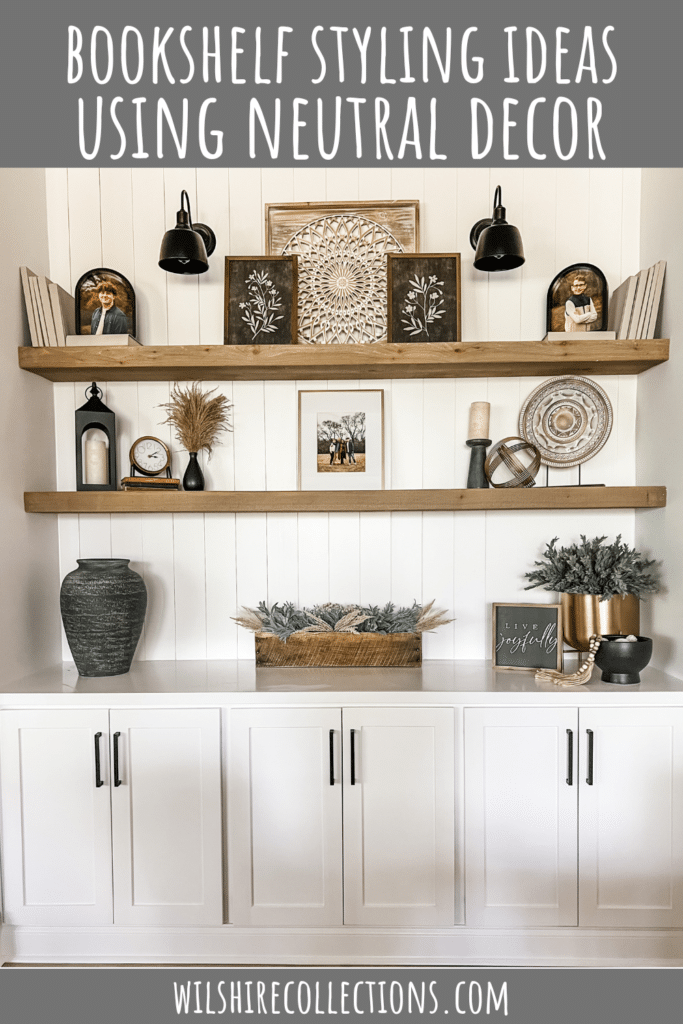
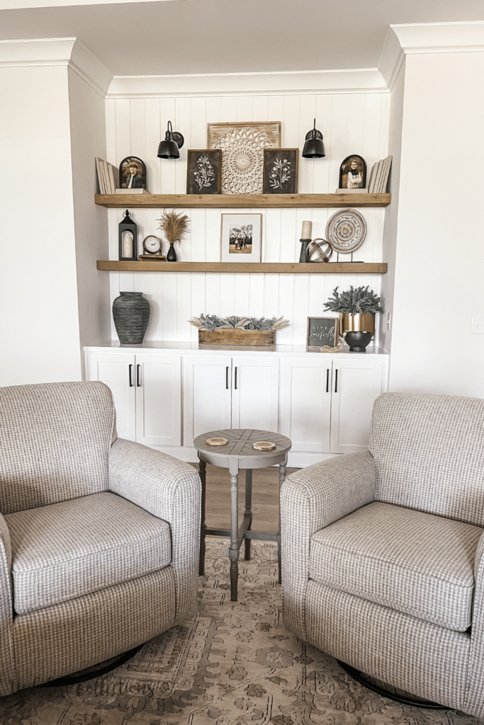
Let me start off by saying that this is a space in the house that we actually designed and had added. It was originally in the plan as wine bar, but I knew as soon as I saw the big niche that it needed a BIG built in!
We sketched and planned it out, and it truly ended up exactly like I had envisioned! (This was a pic before the sconces got added)
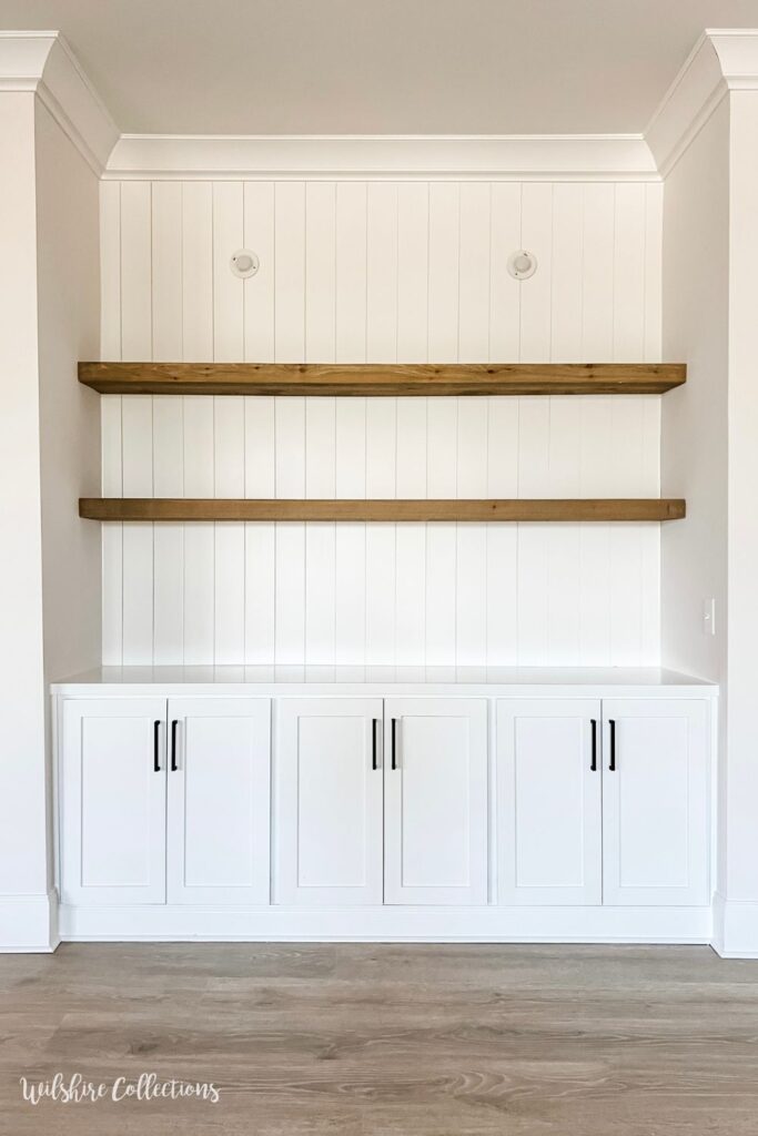
However, I have to say…this has been my biggest decorating challenge to date. Lol. I quickly discovered that because these shelves are SO long (7 1/2 ft each), that a lot of my decor pieces just looked super small up there. Excuse to go shop? I WILL TAKE IT!
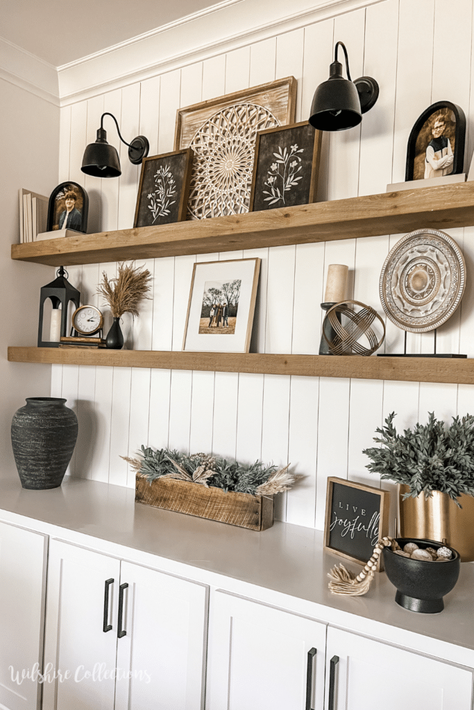
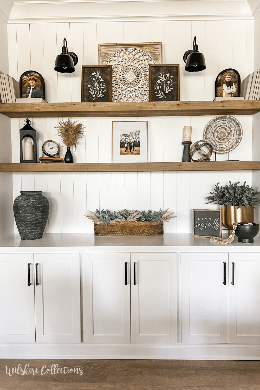
After shopping, playing and moving- then shopping, playing and moving…this is what I landed on for round one of this space!
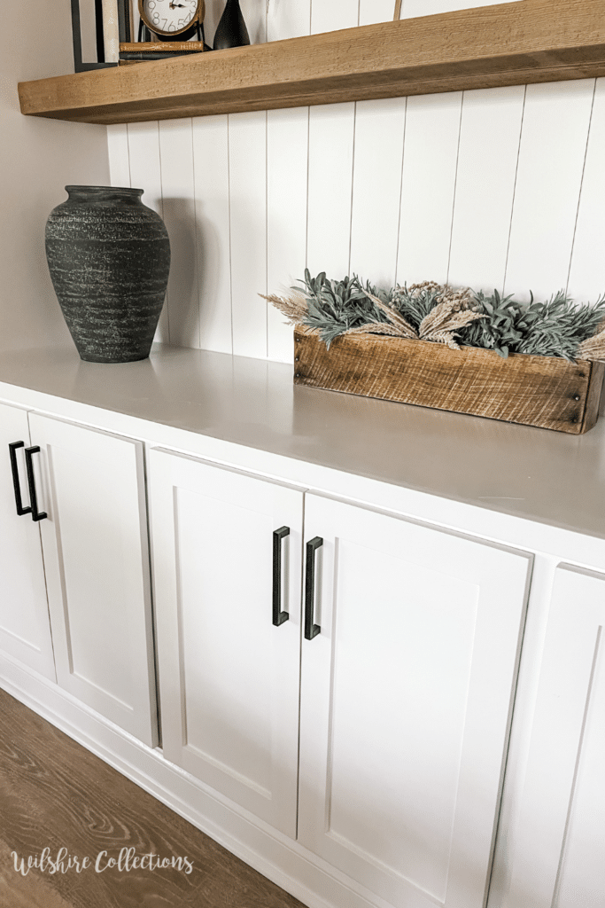
We got a gift card to crate and barrel when we moved, and I ordered this gorgeous vase that I knew would be perfect for the bookshelf!
In the middle, this is where I put my planters box that I filled with greenery and florals. See the quick video of me doing that here!
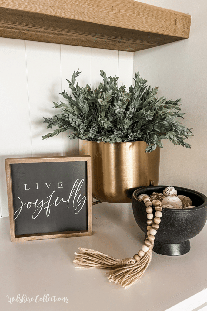
On the other side, the brass piece came from Target and I filled it with greenery from Hobby Lobby. The sign was from one of mystery decor boxes I sold (sold out now) and the bowl came from Homegoods.
Moving on up, a lantern and clock from Kirklands, some old books and a vase from Homegoods complete this vignette.
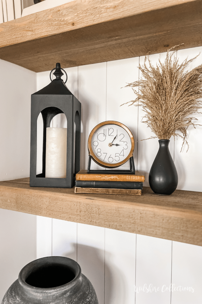
On the other side, all these pieces came from Homegoods…some I already had and some I got new.
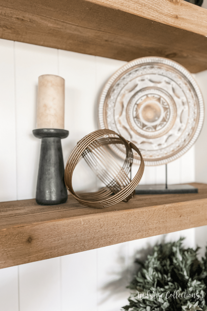
(Notice I am grouping in ODD numbers on my shelves- a huge decorating tip!)
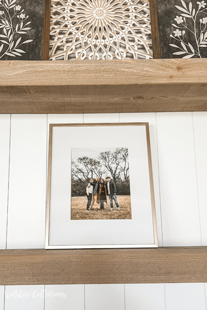
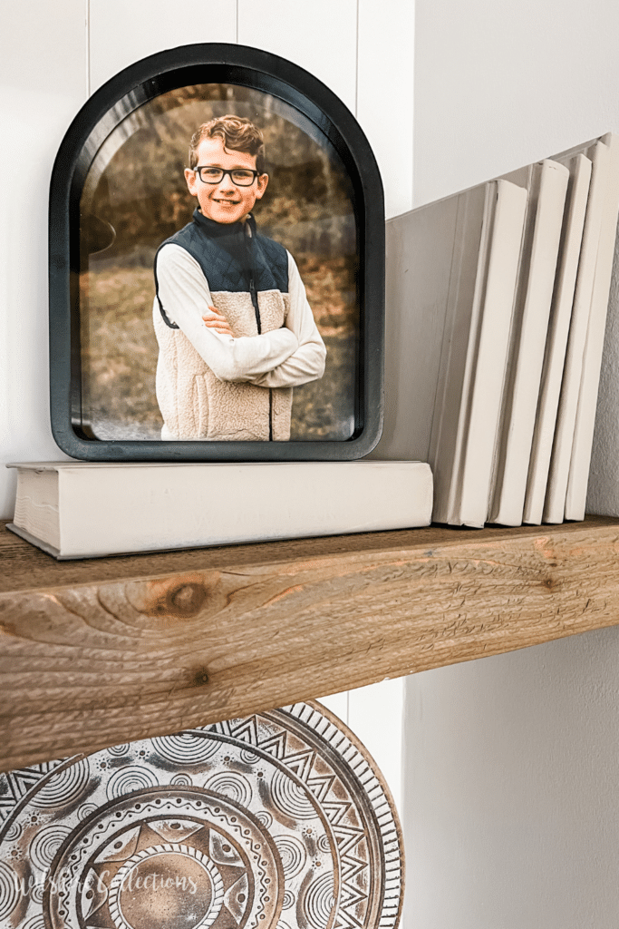
I of course wanted to incorporate some family photos into the bookshelf as well! (Frame from…you guessed it, home goods)
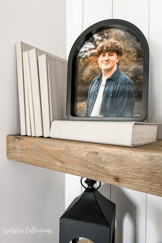
On the top shelf is where I displayed my DIY painted books I recently did! I truly think they helped complete the look here, don’t you?! And I loved these frames from Home Goods (again lol) that I put my boys pictures in!
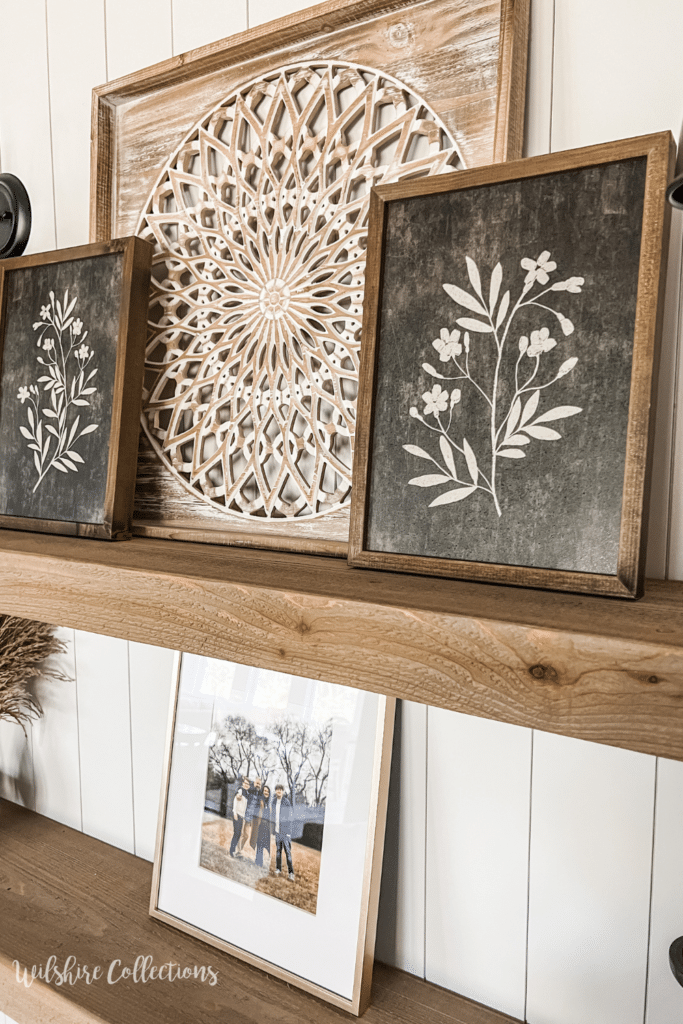
In the middle I did a grouping with a wood piece I already had from Kirkland’s and 2 pieces I recently got from Hobby Lobby! This layered look is a great way to add some visual interest!
I hope these bookshelf styling ideas inspired you if you have some bookshelves of your own! I know they may not be exactly like this, but you can still use some of the concepts.
My biggest tip is to not be scared to have “White space” also known as blank space. The most common mistake in shelf styling is over crowding, which doesn’t give your items a chance to shine!
I know this will be a fun space for me to swap out for different seasons, add color down the road, etc. But for now I am LOVING this neutral look and how classic and clean it feels.
I sit in the living room and just smile when I see it and that’s what it’s all about. Doing what YOU love in your home to make you smile!
Let me know if this inspired you and thanks for taking a peek!
Until next time…
Stacey

That looks amazing!
Stacey it turned out perfect!! I love how you have your pop of gold mixed in with the neutrals!! I can’t wait to see how you change it up for the seasons and all the things!!
It looks great!
This is absolutely beautiful I love the simplicity of it
I love every single bit of these! You
have wonderful taste and the personal touches gives it warmth and personalization ????
This has inspired me for when we get our house built. Hopefully we will start by the end of the year. Everything on the shelves is beautiful. Love the neutral colors.
Wise choice to change your original plan! Love it all from the flow of the black and white pieces and the touch of brass! The light fixtures are perfect for showcasing this space of your precious photos!
I would smile too if I were you! You did a beautiful job on this. You’re so GOOD at this!! Thanks for sharing each step with us, I just love it!!
Very pretty. Stylish.
It’s beautiful Stacey!! I love it!!
I absolutely love it all!!!!
Thanks for sharing!!!!
Stacey, I absolutely love ❤️ your decor of the bookshelves. As I was looking through the blog, the one thing that came to mind is that your decorating style is so like mine but also you don’t show us a style that people can’t afford. And that really means alot. Alot of things you see on decorating shows are way out of most people’s price range. I appreciate that you are more down to earth and I feel like you are just one of us showing us what we really can do!
Gosh this means the WORLD to me! It’s super important to me to do a lot of things as budget friendly as I can, so thank you for saying that!
Looks beautiful! Only thing I might do differently is add more books, some standing, some stacked horizontally. Kinda makes it cozier. Well done!
Such a great job. You are definitely an amazing decorator
I appreciate that you share the names of the stores where you purchased items and that they are affordable! I live in a tiny town in NE and so when I get away I can find those stores and have fun bargain shopping! Thank you for always being so genuine!
Aww, you are so very welcome!